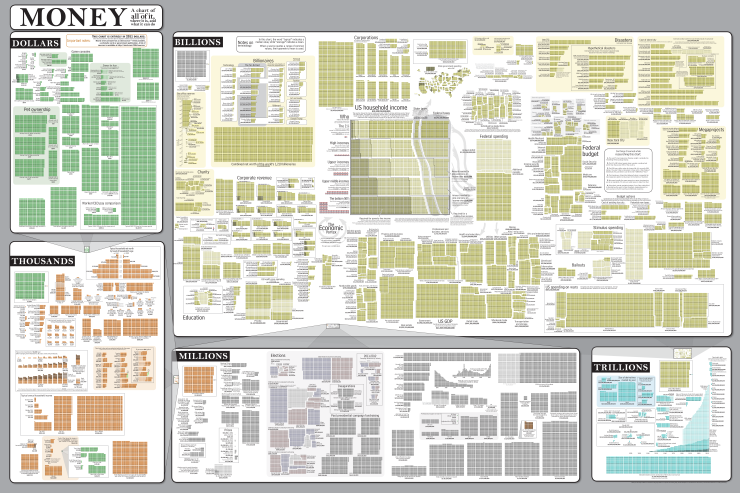
Randall Munroe at xkcd created an epic infographic, called “MONEY: A chart with almost all of it, where it is, and what it can do”.
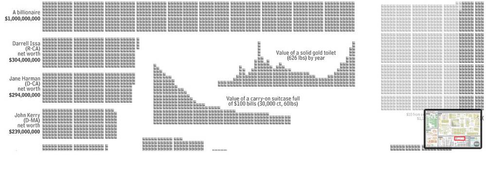
It charts what money can buy – all the way from a single dollar up to the world’s entire economic output. The chart details are amazing. If you zoom into it you can analyse things like the cost of one B-2 bomber ($2,500,000,000) against the US per capital income in 2005 ($32,360).
Well worth spending some time zooming into and out of the chart to get a sense of the proportions involved…truly staggering.
For the full infographic in all its detail, zoom over to XKCD’s Money


 Infographics