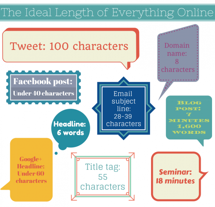
A simple guide for the ideal length of all your online content.

(h/t thenextweb)
Ruslan Ekineev created what he calls “The Internet Map,” an interactive visualization charting 350,000 websites from 196 countries. Each website is represented as a “planet”, with size is determined by traffic, and color by national origin. Ekineev explains:
Every site is a circle on the map, and its size is determined by website traffic, the larger the amount of traffic, the bigger the circle. Users’ switching between websites forms links, and the stronger the link, the closer the websites tend to arrange themselves to each other.
A screengrab from the map below shows Ireland’s Internet Map, with the largest website being google.ie. No surprises there.

(via boingboing)
Pingdom.com have created an animated GIF illustrating the development of the world’s online population over the past 20 years. The data comes from the World Bank and shows that there are now an estimated 2 billion Internet users as of March 2011, representing about a third of the world’s population.
Regarding the animation:
Some statistics from the Pingdom blog post:
(via Pingdom)