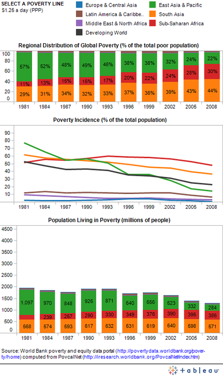
The World Bank just launched a new Data Visualization Tumblr blog dedicated to the latest and greatest open data visualizations on the fight against poverty.
The blog is part of the bank’s Open Data Initiative and will feature “open data visualizations made by economists, graphic artists and all of you open data enthusiasts from both inside and outside the Bank”.
The first visualization presented on the site details Global Poverty Trends and was created using the bank’s re-vamped version of PovcalNet: an interactive on-line computational poverty analysis tool. The team downloaded the table with regional poverty estimates and then used PovcalNet to calculate the results for additional poverty lines. They then combined all the data in the three-panel visualization below – for full interactive version of the chart check out Seeing Between the Lines: Visualizing Global Poverty Trends .


 Infographics